- Image4 Marketing
- Featured Projects & Award Winners, Financial Services
- January 11, 2022
Service Credit Union is known for their forward-thinking service and products. As part of a Brand update, SCU chose Image 4 to re-imagine and deploy a fresh in-branch experience that presents SCU’s authentic Brand.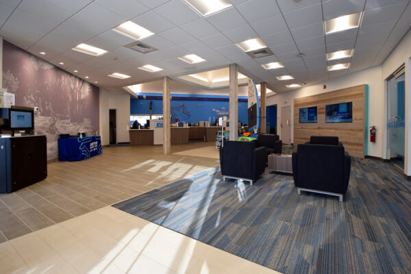
PROJECT: Complete In-branch Brand Refresh
CLIENT: Service Credit Union
LOCATION: Franklin, NH
Service Credit Union Flies High with In-branch Brand Refresh

Project Overview
Service Credit Union was established in 1957 to support military personnel and their families at what was then Pease Air Force Base in New Hampshire. Since then, it has grown to serve members all over the world. More than 800 employees provide financial services at 50 walk-in locations throughout New Hampshire, North Dakota, Massachusetts and Germany.
Wendy Beswick, Service Credit Union’s Vice President of Marketing, has recently initiated a Brand update and Kristen Remick, Creative Services Manager partnered with Image 4 to develop and implement the in-branch program, upgrade branding on the ATM network, and implement an in-branch merchandising program.
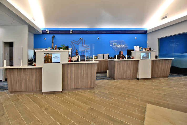
The second branch to be updated, the Franklin, NH branch was redesigned by DRL Architects to open up the interior spaces, create a waiting lounge, upgrade a teller line to technology-based pods, and reinvent both office and back-office spaces to a more modern and comfortable design.
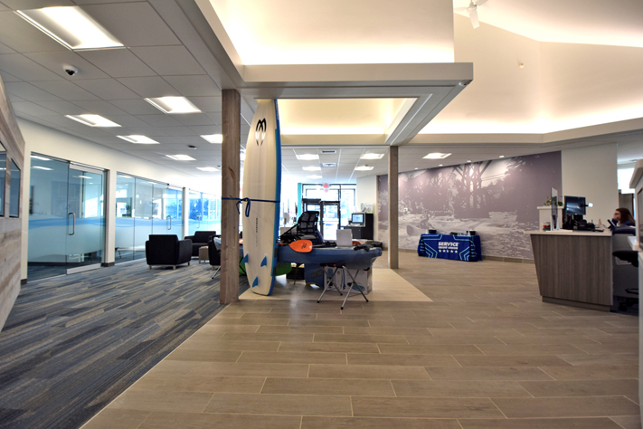
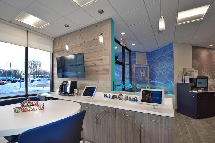
Exterior paint was refreshed along with adding the updated logo to the “tower” on the building. The Service Credit Union blue and cyan color palette was applied and relieved with bright white ceilings, light beige tiles and woven carpet. Interior elements were skinned in reclaimed barnboard bringing a modern rustic touch to the space. Surface finishes and furniture were upgraded to today’s design standards and durability. A digital/technology area was integrated into the waiting area and allows members to access accounts, as well as delivering merchandising messages.
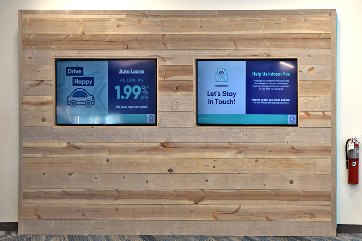
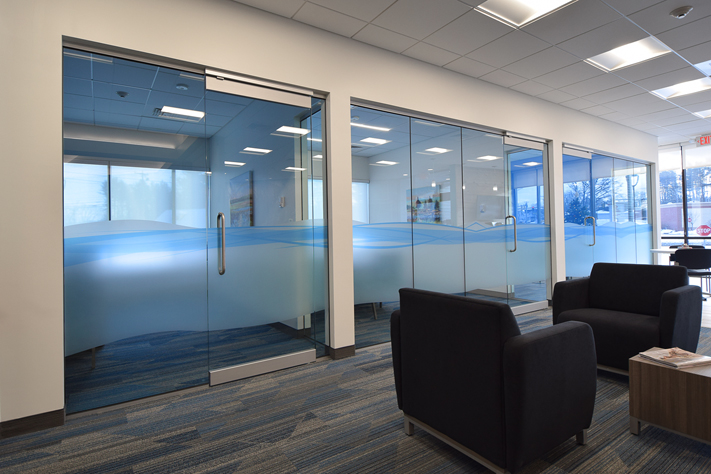
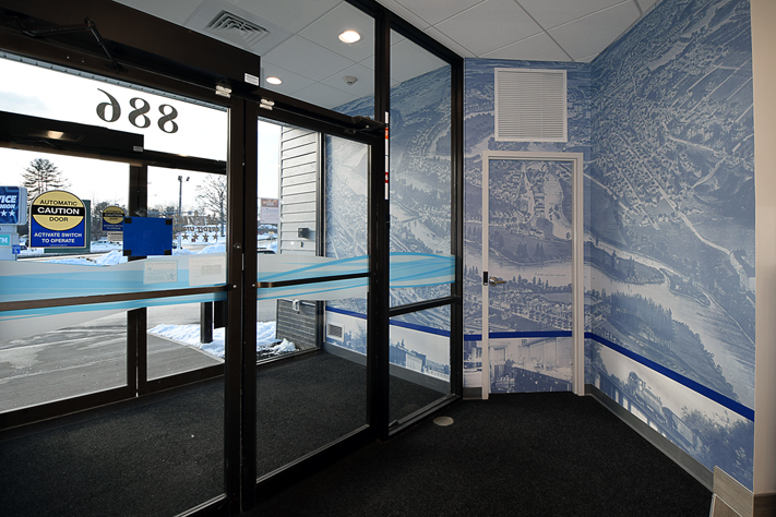
To localize the space and present SCU’s new Brand, Image 4 designed and installed mural-size wallcoverings of an historic map and a local kayaking scene. Behind the pods, logo elements of brush aluminum complement the Values installation, topped by SCU’s positioning statement. Custom-fabricated privacy dividers and sneeze guards help both members and staff maintain wellness as they interact at the now pods. Glass office fronts were frosted in a custom-designed brand shape which has been deployed to all branches as the new Brand rolls out. Offices received fine-art printed canvas images of local scenes. A visual “landing zone” with two monitors surrounded with barnboard helps draw the visitor’s line of sight into the fairly deep branch, and monitors built into the pods show historic and contemporary local photos and member-focused messages. The ATM surround was refreshed with on-Brand graphics, and both interior and exterior compliance signage was redesigned, branded and updated.
The refreshed branch is much more efficient to use, with 3 FTE’s capable of handling most of traffic hours. The offices are now visible, easily accessible to both members and staff, and feel fantastic with natural light, up to date décor and colors. Members can immediately access the cash and coin counting machine, the digital/technology space, and the lounge area and be immediately assisted by branch staff. Cash handlers and an upgraded account access system allow staff to support members’ needs efficiently. The branch delivers a fresh modern experience to members and staff, and presents the Credit Union’s values and authentic Brand to all.